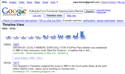
Google has been experimenting with it’s search UI lately. It’s nice to see, because for the most part, there has been very little search UI innovation reaching the mainstream in the last decade.
I’ve been making use of their timeline view lately. They extract dates from the text of pages and then present them in chronological order with a timeline for drilling down. It’s been really handy for finding blog posts talking about specific presentations at various conferences — often the slides from the talk are published, but the added context the speaker gives is usually missing and people’s lecture notes help fill in the gaps.

There is no exposed UI for invoking the timeline view, other than some examples on Google Labs, but you can trigger it by adding “view:timeline” to the end of your search terms. For example:
It’s already quite handy, but there are a few things I’d like to see that would make it more useful to me:
- Reverse chronological view by default — I’d like to see the most recent dates first. Barring that, I’d like a way to swap the sort order with a single click.
- Full range timeline for paging — Right now, the timeline at the top of the page only displays dates associated with the 10 results on the current page, which makes me think there aren’t more recent results (even though there often are). I’d like to see either the timeline for the entire result set, or some sort of indication on the timeline that there are earlier or later results available.
- Better result titles and summaries — Ordinary google search results show the page title and then a snippet of text containing your search term. The timeline search moves the page title to the bottom of the result (and often cuts it off) and replaces it with the year found in the text. The summary text then emphasizes the year. My reaction is that I’d rather have basically the same result format as ordinary search results with the addition of the year somewhere less obtrusive, perhaps at the end of the title line. The date is really secondary to the search term, it’s a handy way of ordering the results, but it’s not necessarily important in its own right (if it were, I would probably try using it as part of my search term)
It seems like I had one other gripepiece of constructive criticism, but I can’t think of it now.
It will be interesting to see if this ever makes it into the main google search UI.