I like to keep my Windows taskbar on the right-hand side of my screen, rather than in the default position across the bottom. This arrangement lets me easily scan the titles of a lot of open windows and pick the one I want to switch to in a single click. The default arrangement only provides easy access to a handfull of windows. It also gives me as much vertical space as possible, which is generally more useful than a lot of width when working with text.
Unfortunately, a lot of software is only designed for the default behavior. “Microsoft’s antispyware used to have a big problem”:http://www.geekfun.com/2005/05/10/stupid-microsoft-antispyware-trick/ with this until they finally fixed it.
I just noticed that iTunes has a toolbar that fits in the taskbar. Unfortunately, it doesn’t work very well with my arrangement. Very frustrating. I’d really like easy access to iTunes in my toolbar. The popup menu in the system tray isn’t very easy to use.
Stupid!
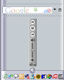
Looking at the screenshot, I realize that its even dumber. The icons on the buttons and for the volume control are all oriented properly but the rest of the toolbar is rotated.