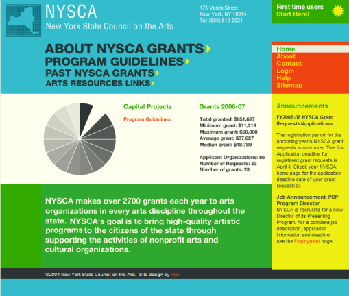
It’s a bizarre accident that I even found this, but I really like the look of the home page of the New York State Council on the Arts. It reminds me of an faded and worn annual report that has been sitting in a drawer for decades.

It’s designed by Flat. I like their other work too.
Huh. I just glanced at NYSCA, and it’s not faded at all. I sorta wish it was. I like purposeful color schemes, and see them so rarely. Perhaps your local CSS settings?