Category Archives: General

Everyblock kix Fwix’s Ass

TechCruch covered the launch of a new startup called Fwix. Fwix is the project of a couple of former Facebookers. It provides a city-by-city feed of from content various social media, including Twitter, Flickr, Craigslist, Yelp, and others. Right now they only cover NY, Chicago, Boston & LA.

On the other hand, just a few days before, Everyblock.com announced that they’d added 3 new cities to their hyper-local news site, including Seattle. Everyblock pulls in some data from the same sorts of websites as fwix, but they go a lot further. Besides covering twice as money cities, they let you filter things down the the level of a couple of blocks. More interestingly, they’ve gone to the trouble to unearth siloed local government data for things like restaurant inspections, police reports, 911 calls, construction permits and more.

I hear ya, it’s not exactly the sort of thing you worry much about when you are 22, but the point is, they are doing some heavy lifting, rather than plucking low-hanging fruit. Oh, did I mention, Everyblock is releasing its source code in 2009 after their funding, a grant from the Knight Foundation, runs out.

Google Insights Bug?

I’ve been playing with Google Insights more and I’ve run into unexpected behavior. I’m not sure if it is because there is a bug, or because it doesn’t work like I think it should.

If I look at searches for “Picnik” for the last 30 days, I see an interesting distribution across several states. If I do the same search for July, I see a similar pattern.

If I instead do a search for multiple date ranges (Jan, April, Jun, July) I get a map (and a table) that shows all the search volume as coming from California. If I use the pulldown they provide to change the time period mapped, the distribution remains the same. Even July shows that all the search volume for “picnik” comes from California.

I tried changing the span of the first time period. It looks like there is a bug, it only displays the results for the first time period, even as you try and switch to new time periods. It’s confusing, because it changes the color coding.

I’m seeing this with the latest version of Firefox 3 on a Mac.

Mudwrestling Slippery Data: Google Insights

Today Andrew Chen posted about his experiments using Google Insights for Search to draw conclusions about the audiences of a variety of websites.

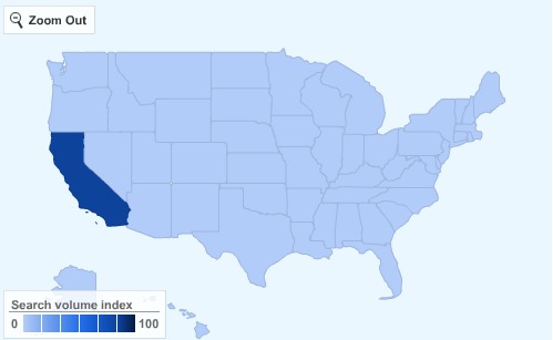
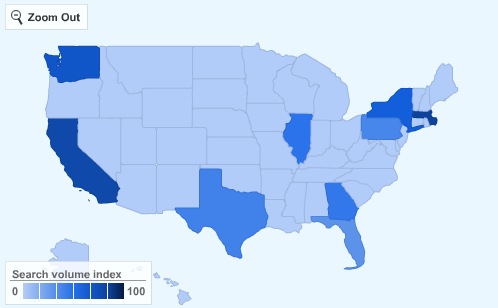
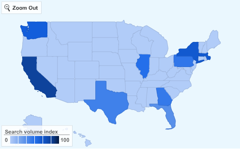
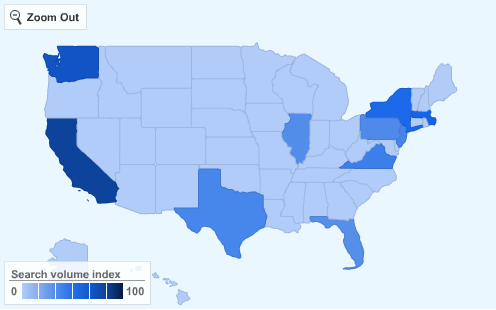
He looked at MySpace, Twitter, Digg, Facebook and a few others. He used the geographic distribution of people searching for the name of each site as a proxy. If a site’s searchers were concentrated in California, he concluded that it had only caught on with the Silicon Valley / Early Adopter crowd. Other sites, like MySpace, showed fairly uniform distribution across the US. Facebook had broad distribution, but skewed towards the east coast. Perhaps most interestingly, Twitter looked like it was on its way to wider adoption.

Andrew also looked at the distribution of people searching for Techcruch. He found that almost all of them were in California. This attracted the attention of Erick Schoefield, a writer for TechCrunch. He was surprised by Andrew’s results and decided to dig deeper. He noticed that Andrew had searched for the full domain name (ie Techcrunch.com), rather than just the site name (ie Techcrunch). When Erick searched for just “Techcruch” he saw a much broader distribution. It was still heaviest in California, but tech and media centers like WA, TX, MA & NY also had a strong showing.

I’d been meaning to check out Google Insights for myself, and these two posts gave me the impetus to finally do something about it. My background is in Biology, which I majored in in college, so I was taught to approach any data, and the conclusions drawn from it, with a skeptical eye. It’s taken me a long time to get used to the sloppy with which numbers are used in a business setting. Whenever I see a graph, I’d want to see the error bars. I’ve learned to get used to it. You have to when even commercial data sets that cost hundreds or thousands to get acccess to have all sorts of quirks and caveats attached to them.

So, I look for possible biases in the underlying data. The most obvious question is how closely searching with a site correlates with actually using the site. This is a question I can’t afford to answer with much precision, especially since I don’t (yet) have access to the traffic stats on a reasonably popular site to calibrate against, but I do know that a lot of people search for sites they regularly use rather than using a bookmark or typing in the URL directly. It may actually require fewer keystrokes, clicks, and cognitive load. So I’ll accept the idea that it’s a reasonable proxy.

Still, I wondered if it wasn’t a better leading indicator of interest, rather than an indicator of actual usage. Again, this isn’t something I’m going to be able to nail down, but it did lead me to discover that it is possible to slice the Google data month by month. I’ll show the results below for Twitter.com

I wanted to start before with Twitter’s launch in July 2006, so I could get a baseline, but the baseline was effectively 0, because Google gives an error that there isn’t enough data on the volume of searchs for “twitter” until you get to Jan of 2007.

January ’07
April ’07
July ’07
October ’07
January ’08

April ’08
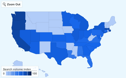
July ’08
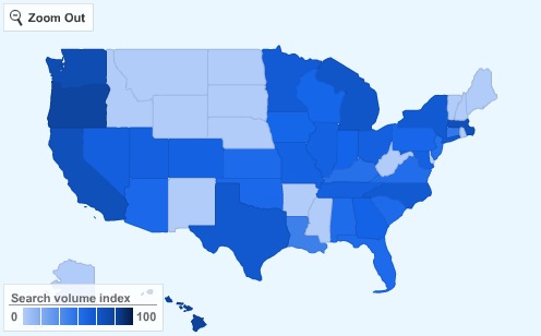
Being able to look at a time series of data is awesome, because you can start to eyeball relative trends and not worry so much about the inaccuracies of absolute measurements (assuming the methodology for data collection remains pretty constant from period to period).

Looking at this series of graphs shows a clear progression. There seems to be echoes between Twitter’s overall traffic and the trends that Google Insights reveals. I’ll pull up a traffic graph from Compete.com & Quantcast.com. Unfortunately, I can’t go further back than a year without coughing up some dough, but the graphs are helpful none the less:

Interesting to look at everything together. The Google Insight maps change dramatically between January and April of 2007, but then look pretty similar for the rest of 2007. The Compete and Quantcast graphs look pretty flat over that same period.

The Jan 2008 graph shows a bit of a geographical advance just as the compete.com and quantcast graphs show an upward inflection after a period of slow growth.

Anyway, that’s all I have time for right now. Thanks to Andrew for getting the ball rolling and to Erick for refining the methodology. I hope this post ads to the body of knowledge on how to use Google Insights data.

Update: Ok, so I’ve been playing with Google Insights a little more. I’m running into some behavior that surprises me. It looks like there is a bug when you search multiple date ranges.

Dumb iPhone NetShare Conspiracy Theory

Yesterday an app showed up on the iPhone Application Store called “NetShare.” NetShare, which is a product of Nullriver, is a SOCKS proxy which let’s your Laptop connect to your iPhone over WiFi and share its EDGE or 3G Internet connection.

This arrangement is typically called tethering. It is a common feature with a lot of other phones. You are supposed to pay $30 or so on top of your standard data plan to use it, though a lot of people get away with using it with basic data plans. There is no tethering plan for the iPhone.

It was a little suprising to see such an app on the application store. So, it wasn’t much of a suprise when it registered as unavailable a few hours later.

Then it showed up again this afternoon, before disappearing again. I managed to snag a copy before it vanished again. It seems to work pretty much as promised.

I don’t know what is going on. One of nullriver’s other apps, Tuner, which plays streaming audio, had a similar on-again-off again presence early in it’s existance, but it has been solidly available for a while.

My theory is that this is just a glitch, and that Apple let the product through on the first place because they aren’t ready with their own tethering app. I think a later version of the firmware will bring tethering and the opportunity to give AT&T even more more money every month. As a consolation, AT&T will finally turn on free wifi at their Hotspota for iPhone owners with an appropriate data plan.

Yeah yeah yeah. I know, it’s a lame theory but at least I did it in a fee thousand fewer words than Cringley would have spent on it.

Current Market Value of a Vote in Congressional Races

You can tell it’s an election year, because the price incumbent congressmen are willing to pay for a vote seems to be near an all time high.

Congress just passed legislation that is expected to help 400,000 homeowners who risk having their homes forclosed on. The measure includes $3.9B in grants to acquire already forclosed homes from banks, $180M in pre-forclosure counciling, and $15B in tax credits.

By my count, that works out to be $19B in the hopes of securing 400,000 reelection votes, or $47,500.

That seems pretty high to me. It’s probably safe to assume that the households this helps often contain more than one voter. Figure 1.5 voters per household, we are at $31,666. That seems high. I wouldn’t be suprised if the price of votes is being pushed up significantly by those damn speculators we’ve been hearing so much about.