I’m trying to book a flight using the continental airlines website. I clicked to check the cancellation/rescheduling terms and I was met with a CATCHPA. I entered it, and I was told that I mis-entered the text and was given another CATCHPA. I’ve now tried ten times or more and it still won’t take the text I’ve entered. The distorted text isn’t even particularly hard to read.
If the airport I were flying into had more options, I’d book a flight with someone else.
Category Archives: Stupid Tricks
Stupid Thunderbird Trick
Mozilla Thunderbird has a really annoying “bug” when dealing with messages with large attachments on an IMAP server. For some reason or another, it will often only download a part of the attachments, and then stop, never to finish, ever.
Stupid Microsoft Download Trick
Microsoft has released a free version of Microsoft SQL Server called “Microsoft SQL Server Express Edition”:http://msdn.microsoft.com/vstudio/express/sql/. Their hope is, in part, to compete better for mindshare with with “mySQL”:http://www.mysql.com/ and “Postgress”:http://www.postgresql.org/ among price concious developers.
It looks to be a fairly capable offering, so I was going to give it a try. Unfortunately, for some bizzare reason, Microsoft’s servers are only delivering it at 30kb/s. Since I chose the “advanced version” which comes with various extra features, that means I’ve been waiting for 40 minutes, and I’ve got another 40 minutes to go.
I could have downloaded the latest version of Postgres with bittorrent and installed it by now.
Stupid iTunes Toolbar Trick
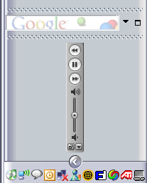
I like to keep my Windows taskbar on the right-hand side of my screen, rather than in the default position across the bottom. This arrangement lets me easily scan the titles of a lot of open windows and pick the one I want to switch to in a single click. The default arrangement only provides easy access to a handfull of windows. It also gives me as much vertical space as possible, which is generally more useful than a lot of width when working with text.
Unfortunately, a lot of software is only designed for the default behavior. “Microsoft’s antispyware used to have a big problem”:http://www.geekfun.com/2005/05/10/stupid-microsoft-antispyware-trick/ with this until they finally fixed it.
I just noticed that iTunes has a toolbar that fits in the taskbar. Unfortunately, it doesn’t work very well with my arrangement. Very frustrating. I’d really like easy access to iTunes in my toolbar. The popup menu in the system tray isn’t very easy to use.
Stupid!

Looking at the screenshot, I realize that its even dumber. The icons on the buttons and for the volume control are all oriented properly but the rest of the toolbar is rotated.
Stupid iTunes Podcast Tricks
I installed iPodder shortly after its release and after trying once or twice to listen to podcasts, I gave up on it. The podcasts I found weren’t that interesting and the “online podcast directory was weak”:http://www.geekfun.com/archives/000402.html.
I liked the whole idea though, and so when Apple decided to make it easier to consume podcasts in the latest version of iTunes, I decided to give things a second look.
There are certainly a hell of a lot more podcasts to choose from these days, thats for sure. I lot of established media players have jumped in, driven, in part, by Apple’s entry into the space. All of which is cool, but I’m most interested in podcasting because of the opportunities it offers the unaffiliated up-and-comers.
In the early days of the iTunes podcast directory, those very people, the people who had pioneered the medium, seemed to be shoved off to the side in favor of the big media types. It took some digging to even find them. Happilly, on my latest visit, the “indies” as Apple calls them, are featured more prominently, including a section featuring a handfull of “interesting indies” near the top of the directory.
But, as you can tell from the title, I found something to gripe about. The process of subscribing to podcasts is utterly irritating. Once you’ve found an interesting looking podcast you click a subscribe button to add it to your subscription list. This is where things get bad.
As soon as you click subscribe, iTunes exits the podcast directory and jumps to your podcast subscription list. The browser buttons disappear and the only way (that I can find) back to your place in the directory to subscribe to something else is to start from the beginning again in retrace your steps. VERY LAME!
The podcasts I’ve listened to lately have been better than the early batch, but there are still a lot that are clearly not worth my time after one or two listens. It would be nice if I could easily unsubscribe from a podcast from my iPod.
Stupid Comedy Central Trick
If you try going to “www.thedailyshow.com”:http://www.thedailyshow.com you get redirected to a page on Comedy Central’s site, which is perfectly fine, since The Daily Show appears on Comedy Central. The stupid thing is that it redirects you to their home page, not their Daily Show with John Stewart page.